The Floor is Lava
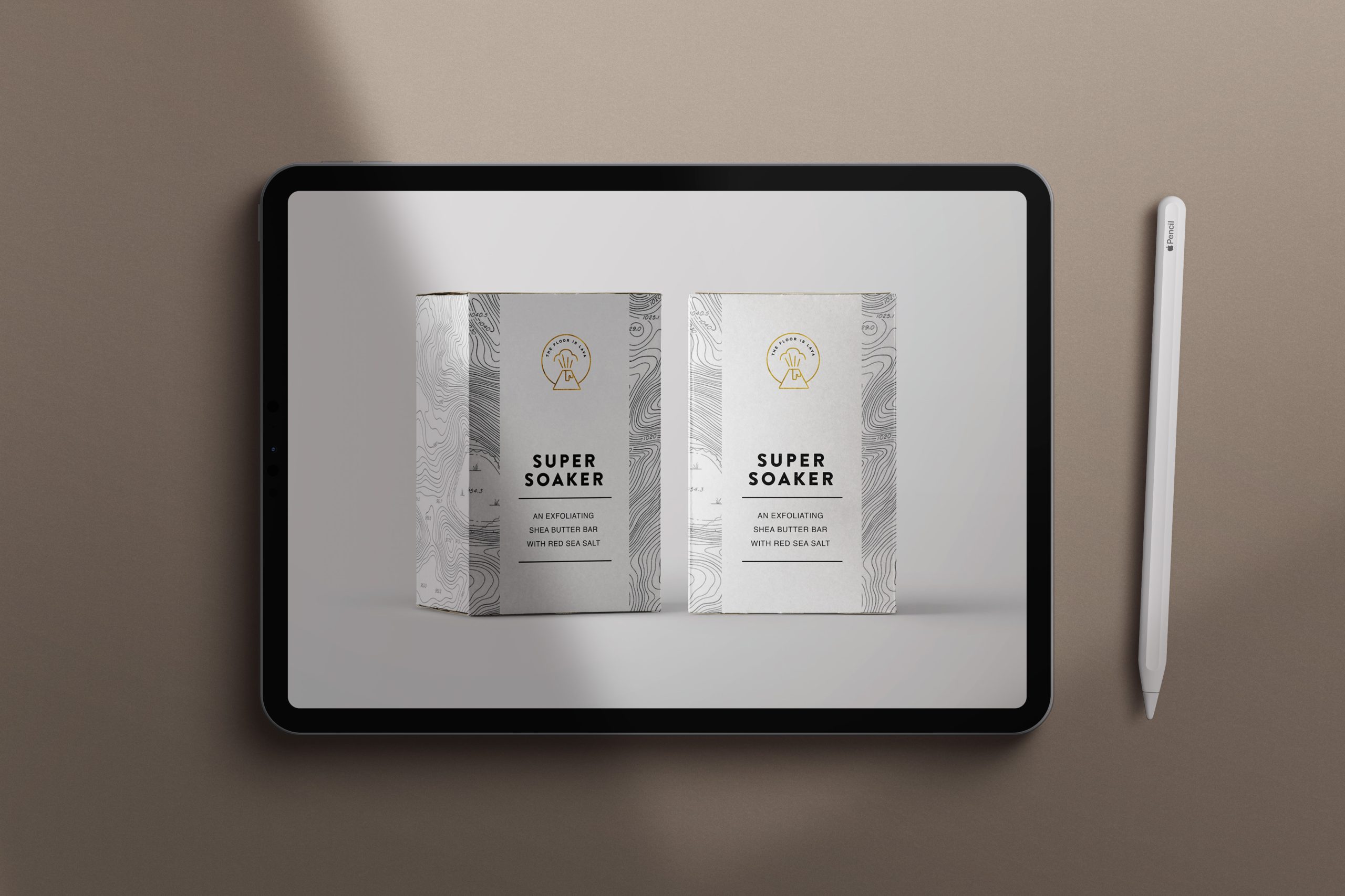
Inspired by the relief maps of Mount Rainier, Meredith developed this concept soap brand aimed at busy parents. The product line included formats friendly enough for anyone in the family, with a skin-friendly charcoal formula to simulate molten rock.
Creative direction and branding
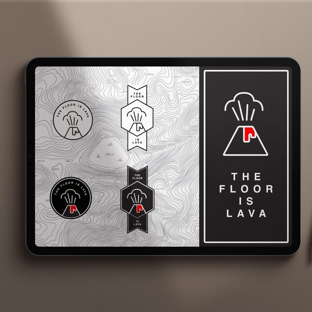
With a simple font offset by stark black and white icons and map textures, the branding was designed to look good in stores and in your bathroom.
Plus, when everything aimed at parents and kids is a hodgepodge of color and confetti, Meredith took a different approach.
Relief maps were converted from real maps to vector files in order to scale across print packaging. Icons were hand-drawn in Adobe Illustrator.
How Meredith made an impact
Although this project only exists in Meredith’s mind, here’s how she envisioned her bringing this to life.